Program Admin's Dashboard
Overview
Hi-fidelity Mockups | UX | 4 weeks | Enterprise Solution for CiscoThis is a feature of Cisco's Lifecycle Advantage (LCA), designed for Program Admin to track the activity of Partners in the email campaign.
Background of LCA:
LCA is a customer engagement program for Cisco Partners that promotes adoption, simplifies renewals,
and upsells to higher-value solutions. It uses action triggered email automation.
Partners bring in customer contacts, to whom the automated emails are sent in groups
depending on the Location, Journey, or Offer.
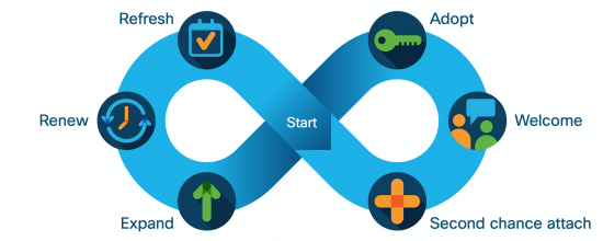
Email Campaign Lifecycle
MY ROLE
In a team of two, I was involved in understanding requirements by collaborating with the Engineering team, Project Managers, Previous Designers, and the Users.
Organic cycles of requirement analysis, brainstorming, design iterations, and feedback for around 8 weeks lead us to reach the final version of the dashboard which was technically feasible and delightful for the users.
Process
REQUIREMENT ANALYSIS
The initial set of requirements were compiled and shared by the Project Manager. A sneak peek of the same is attached below. As we went through the process of brainstorming, wireframing, and gathering feedback from the team, the requirements expanded to around 70%. These came down organically with every meeting (held weekly).
It was found that the requirements captured in the document were incomplete and changed a lot as designs got feedback.
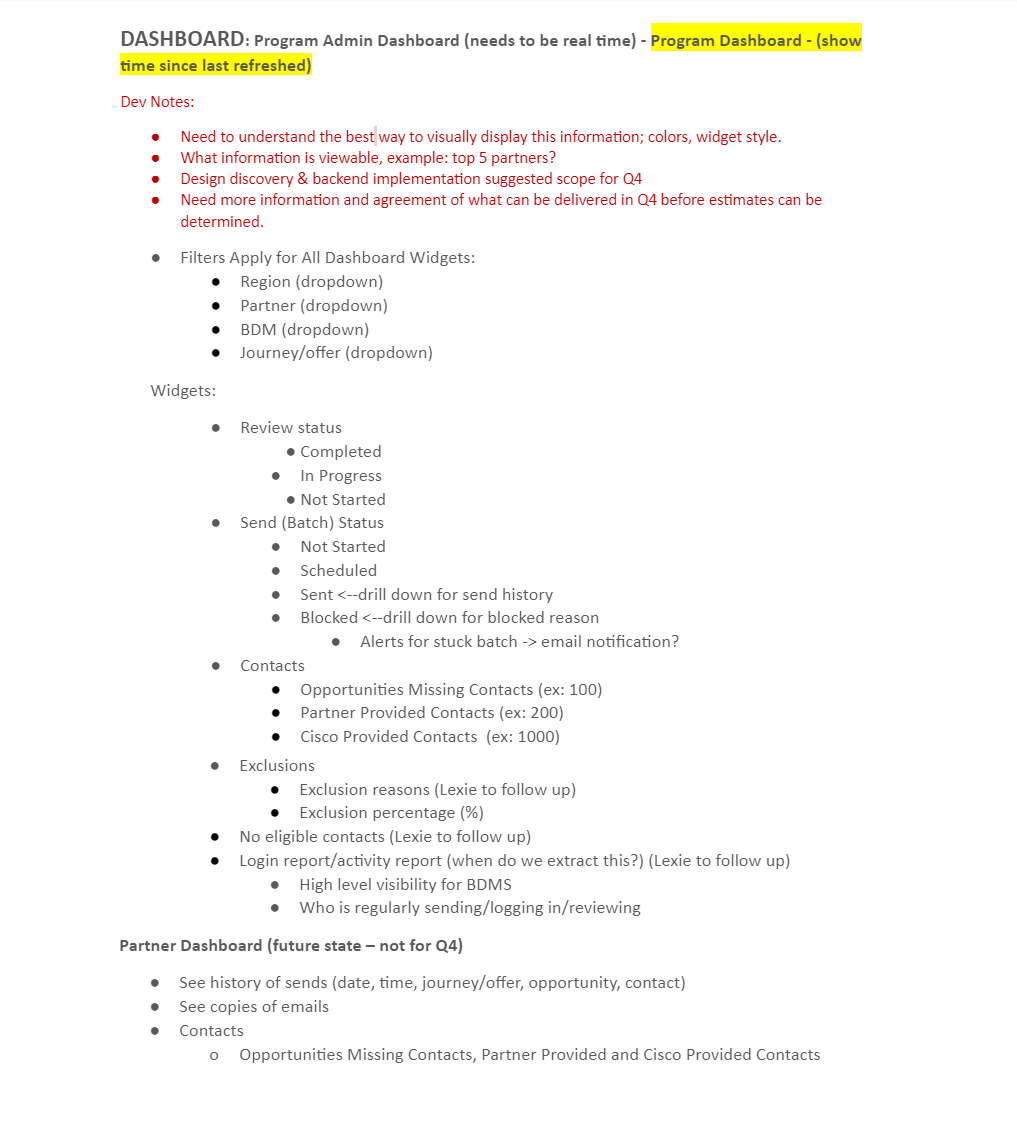
Initial requirements compiled by the project manager
It was found that the information needs to be seen at levels. This was the reason that it can be divided into categories and sub-categories. Program Admins would be checking out Partners' details, the status of their activity with the email campaign, and then would like to dig more into one partner to check the list of customers/opportunities, their details associated with the partner.
IDEATION and DESIGNING
After every cycle of gathering User/Business requirements, taking feedback, ideating, and designing, a bunch of new challenges was encountered every time.
There was an increasing set of requirements in the form of data and filters to be applied to the data. The data was to be sectioned broadly into Partner information and Customer information, the count of each of them could go around 1000s. And the information of each is divided into around 15-20 sections.
Design iterations of the dashboard with changing priorities
The designs were required to be aligned with pre-defined guideline being local to the company. The wireframes could be quickly converted to high-fidelity mockups complete with the visual design. A couple of iterations are attached below, which were proved to be very helpful in getting User's feedback. These design ideas along with the feedback were a game changer as these were very different concepts from what was anticipated by the Engineering team and Managers taking care of the product since its birth.
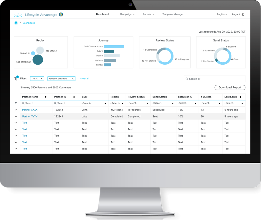
In the first design, the concept of one screen was promoted wherein all the information can be checked out easily on one screen with few interactions, making it easy to compare the switch around between different partners
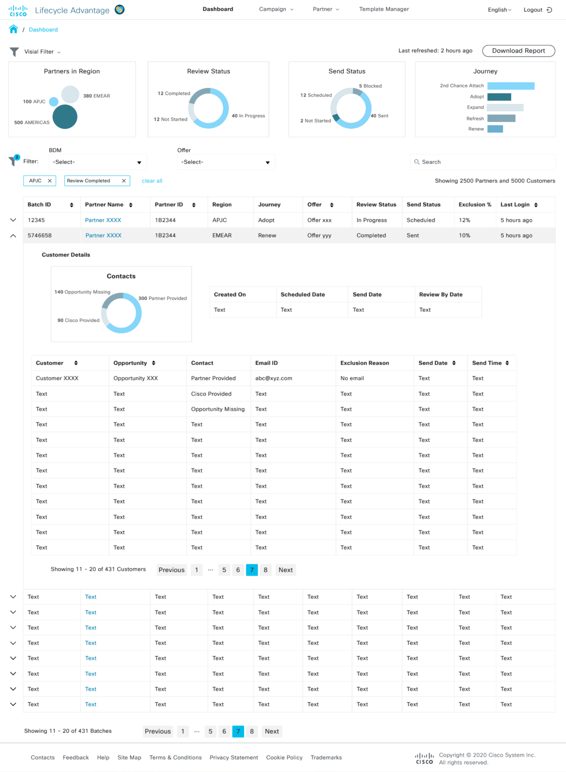
Design for the use-case of data comparison
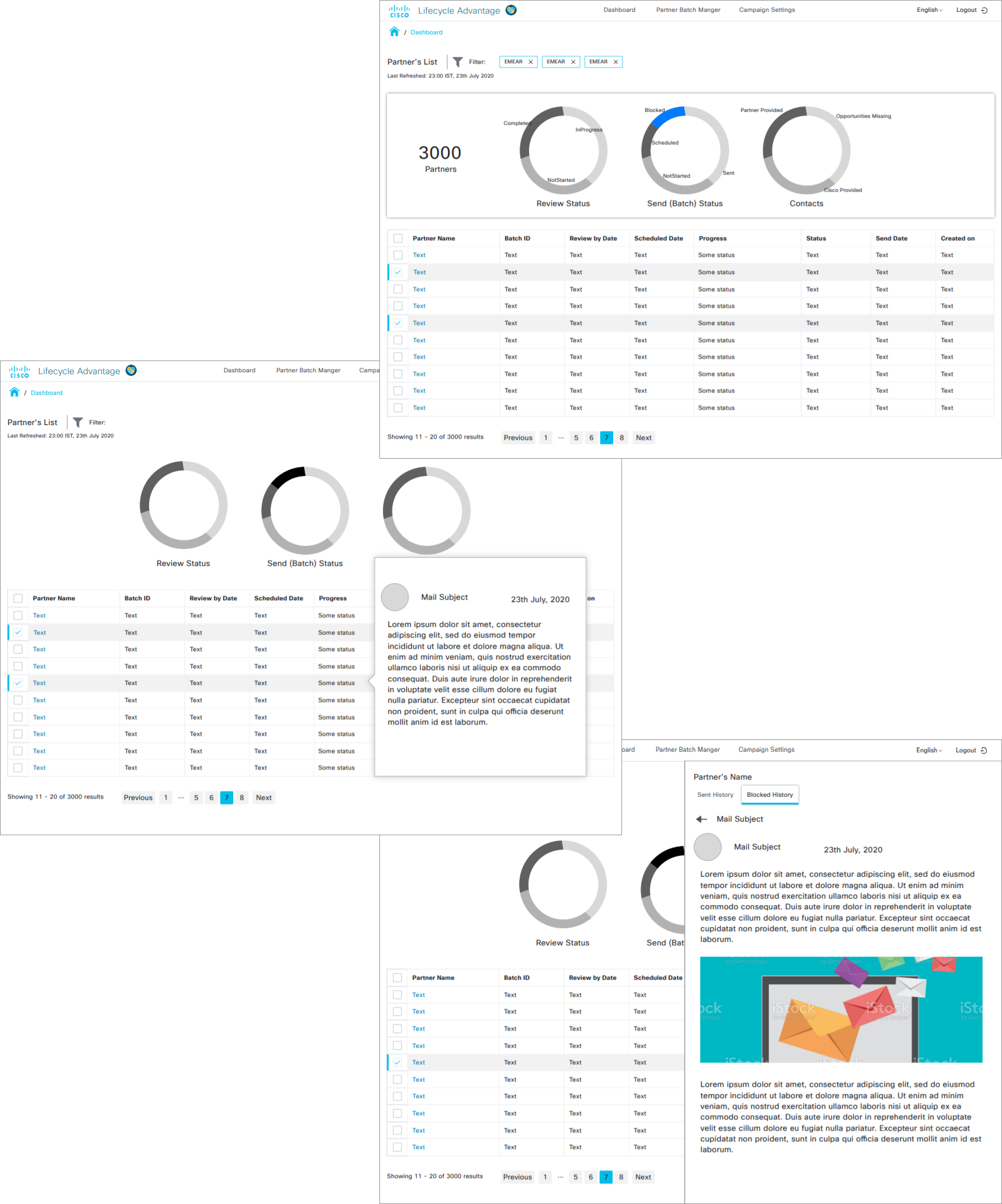
The second design was more towards giving focused view on the information of one partner with their customers/opportunities. It involved two levels of information along with different set of filters.
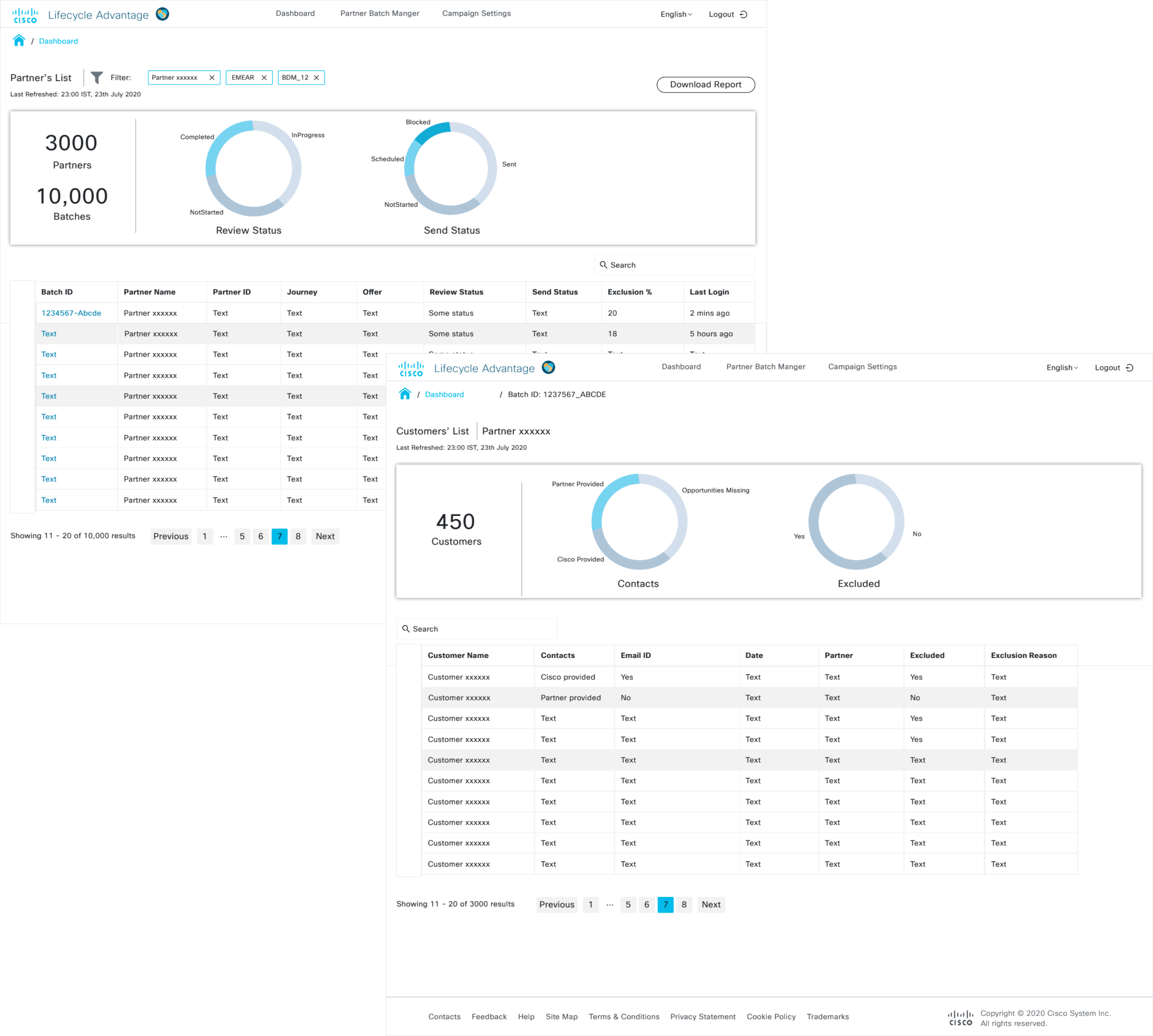
Design for the use-case of the detailed view of data
Challenges and Solutions
As the designs came through the brainstorming sessions with team, there were 4 major challenges encountered:
- A huge amount of data to showcase on a desktop screen satisfying every use case
- Filtering out the information as required
- No clear distinction or categories defined for the information and a vast vareity of use cases.
- Catering the use case of checking the information offline while sharing offline over meetings.
While brainstorming and designing, these challenges were solved:
- With the use of tables and combination of filters, the information was presented to fit almost every use case
- Using a combination of Visual Filters, Inline/In-column filters for best possible results with a huge amount of data.
- Understanding and analysing the requirements by users' mouth word by word. Iterating designs and failing fast
- The capability of downloading report with additional columns and applied filters and visual cues.
Users' Comment
The users put down their thoughts in the comments on the InVision prototype after a walk-through
meeting for every phase.They had few demands, questions, discussions as well as good
suggestions on the different iterations of designs.
Reading, analyzing and after having followed up meetings on these comments, we modified the
designs and came down to a version that best suited their requirements and the work environment.
Below are attached some of the comments.
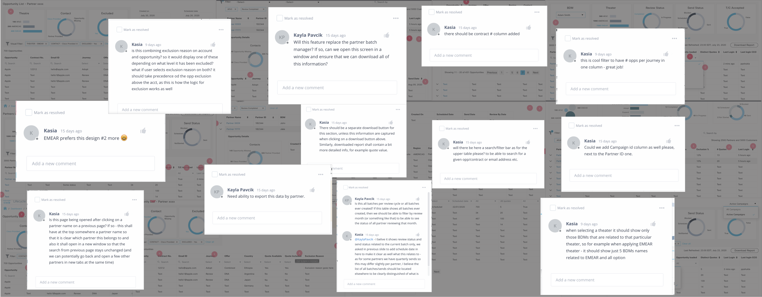
User feedback on the two interactive designs and flow
FINAL VERSION
As the final version, there were combination filters, a ton of data in the form of two tables (Partners List and Opportunity List).
A few of the features are highlighted below, as a solution working best with the challenges and User's requirements/expectations.
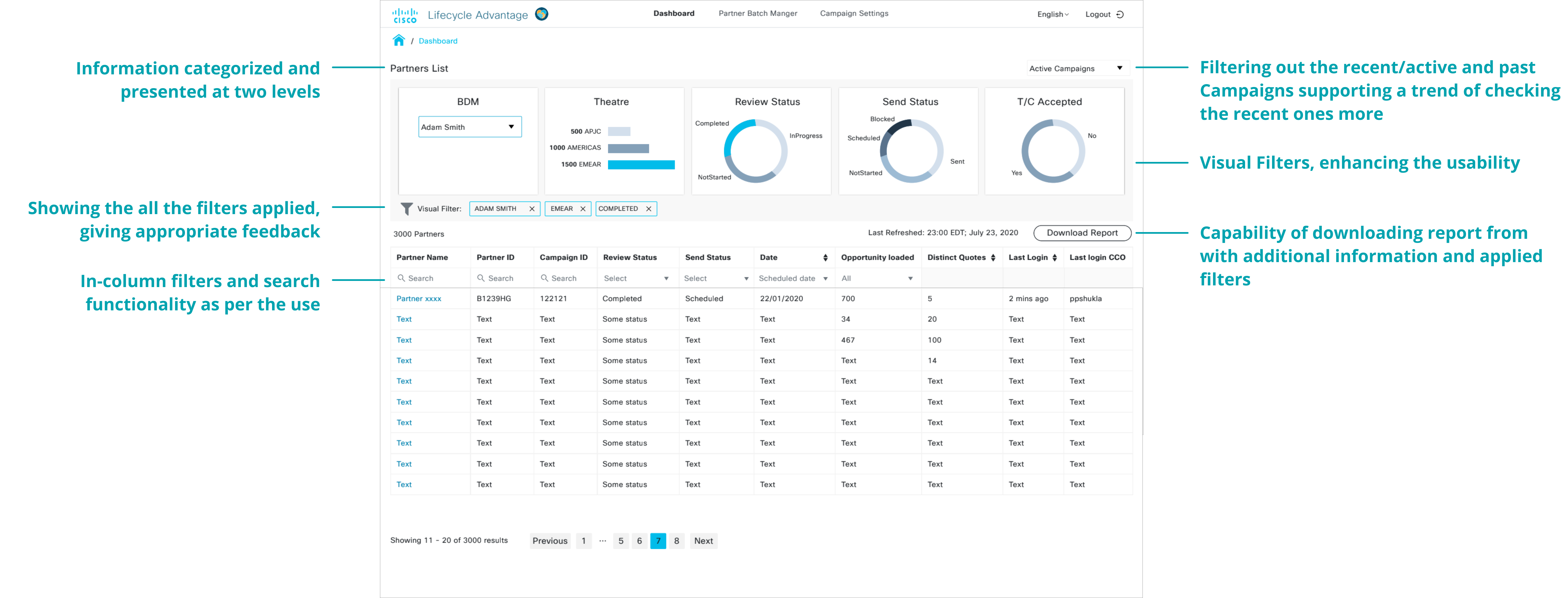
Feature details of the final design, screen-1
Post applying filters, when the user selects one partner to get more details of, they are presented with this screen shown below, having extended details of partners that were relevant with their Opportunity List.
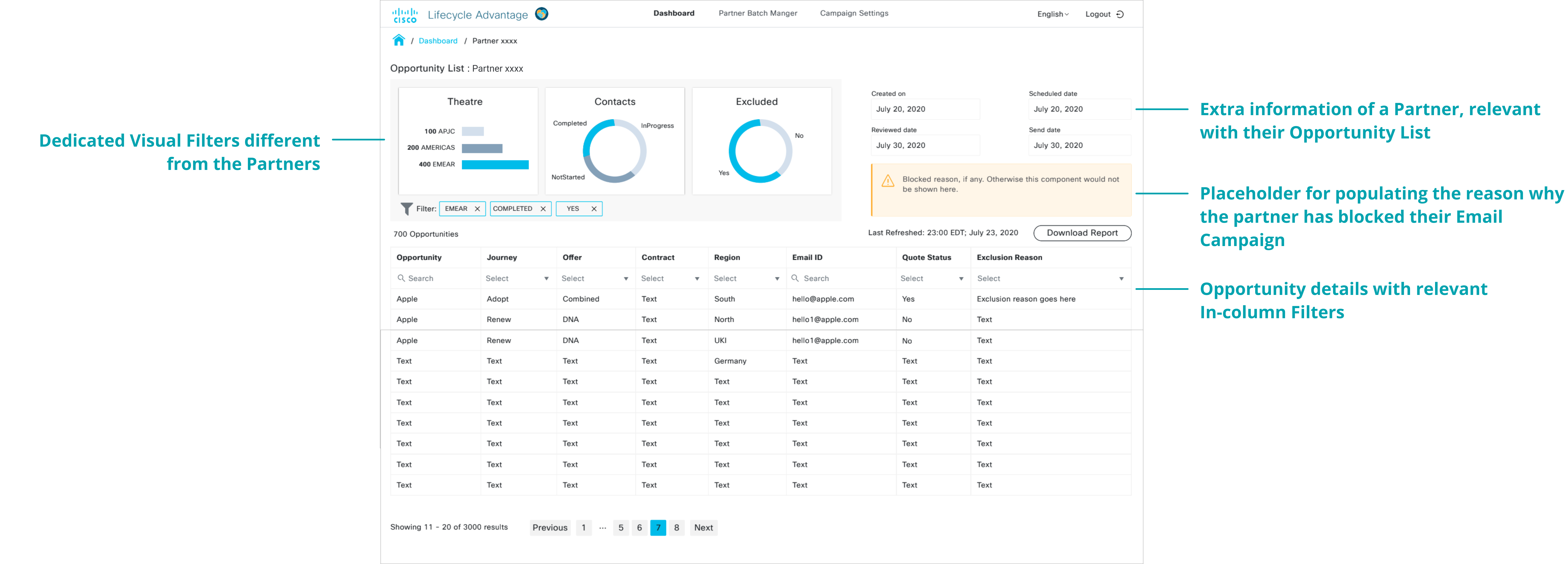
Feature details of the final design, screen-2
Conclusion
As a result of this organic process, we could come up with a design that was working well and also satisfied the users' expectations with visual aspects as well as different features with minor interactions.
We were appreciated by the Engineering Team and Managers for the quick good work on the project.
Credit goes to the quick users' response over the meetings as well as on InVision Prototype, and smooth collaboration with the Engineering Team.